

Dev Diary #1: Make it Nasty, the Negative Item Redesign
Chat with Us on Discord
Join our Discord server to chat with us and other players. Joining helps us a lot (even if you don’t plan to chat).
Bad at a Glance
Hello, Ian here. I’m the main designer and artist on Duple Dragon, responsible for developing the look and feel of the visuals and gameplay on the project. Today I want to talk about items, a catch-all term for the fireworks, rings, and lucky envelopes you collected in Test 1.
One type of feedback we received in Test 1 was that players didn’t find it intuitive which items were good and which were bad to pick up. The bad items didn’t read as negative at first glance, which is no good in a game as fast paced as Duple Dragon. In response to this, I started exploring ways to make our cursed negative items even spookier.
The Old Look
The Old Look
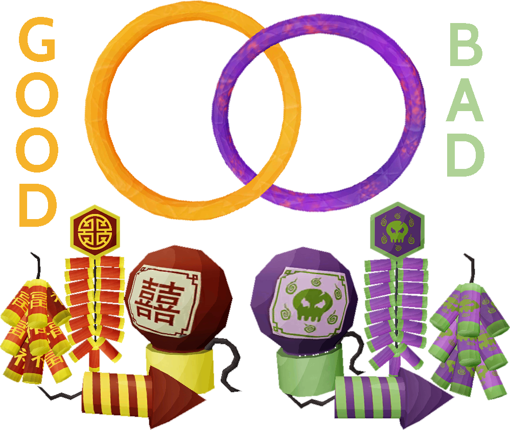
The look for Duple Dragon’s positive items is heavily based on the vibrant reds and golds of Chinese lunar new year celebrations. We love this color scheme, but it can create signalling challenges because red is so often used as a bad color in games.
Since red was already taken for positive items, I decided to use another common color combo used for evil things in games for the cursed items—green and purple. I also replaced the Chinese characters found on the positive items with spooky looking skulls and made them drip (no one wants a wet firework!)
The Art of Differences
When designing objects and characters in games with important gameplay differences, it’s very important that the visuals communicate this difference. Color is not enough; a more important tool to differentiate one thing from another is the silhouette: the outline of the object or character.

No one’s confusing these two
In Test 1, the cursed items used the exact same 3D models as the positive items, the only difference being their textures and effects. Even before we launched Test 1, I was worried about how subtle the differences were and opted to turn the cursed fireworks upside-down to quickly provide a different silhouette in the short term.
Communication is Hard
Despite my attempts to make the cursed items look different from the positive items, feedback told us they still weren’t looking evil enough. They were also too purple, which made some players assume that your purple dragon was supposed to collect purple items, and your gold dragon was supposed to collect gold items—definitely not our intent, but completely understandable.
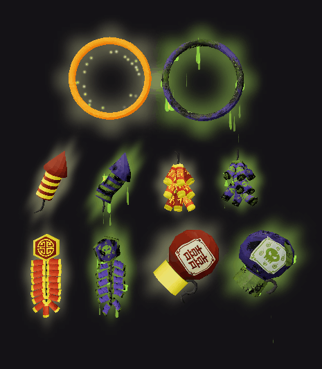
It was time to give our cursed items a make-over. I took them back into the studio and spent some quality time distressing the crap out of them, leaning more heavily into the green side of the color scheme, and adjusting to a colder purple which is much further from the purple dragon’s color.
The results are delightfully nasty. See for yourself!
More to Come
That’s all for today. Team Duple Dragon is full steam ahead on building Test 2, and we have many more peaks behind-the-scenes to share in the future. You might even say the next post will be an expedition!
Comments or Questions?
Join our Discord server and let us know. We always love hearing from you.